I’ve been spending time, probably too much, designing a logo for the project. It’s gone through a few iterations and I’m not sure which is best. They might all be useful for different purposes as well. First below is the original image, next is the first pass at the logo (the one I think looks the best), then there is the cropped and straightened version, and finally the straightened version in the larger picture.
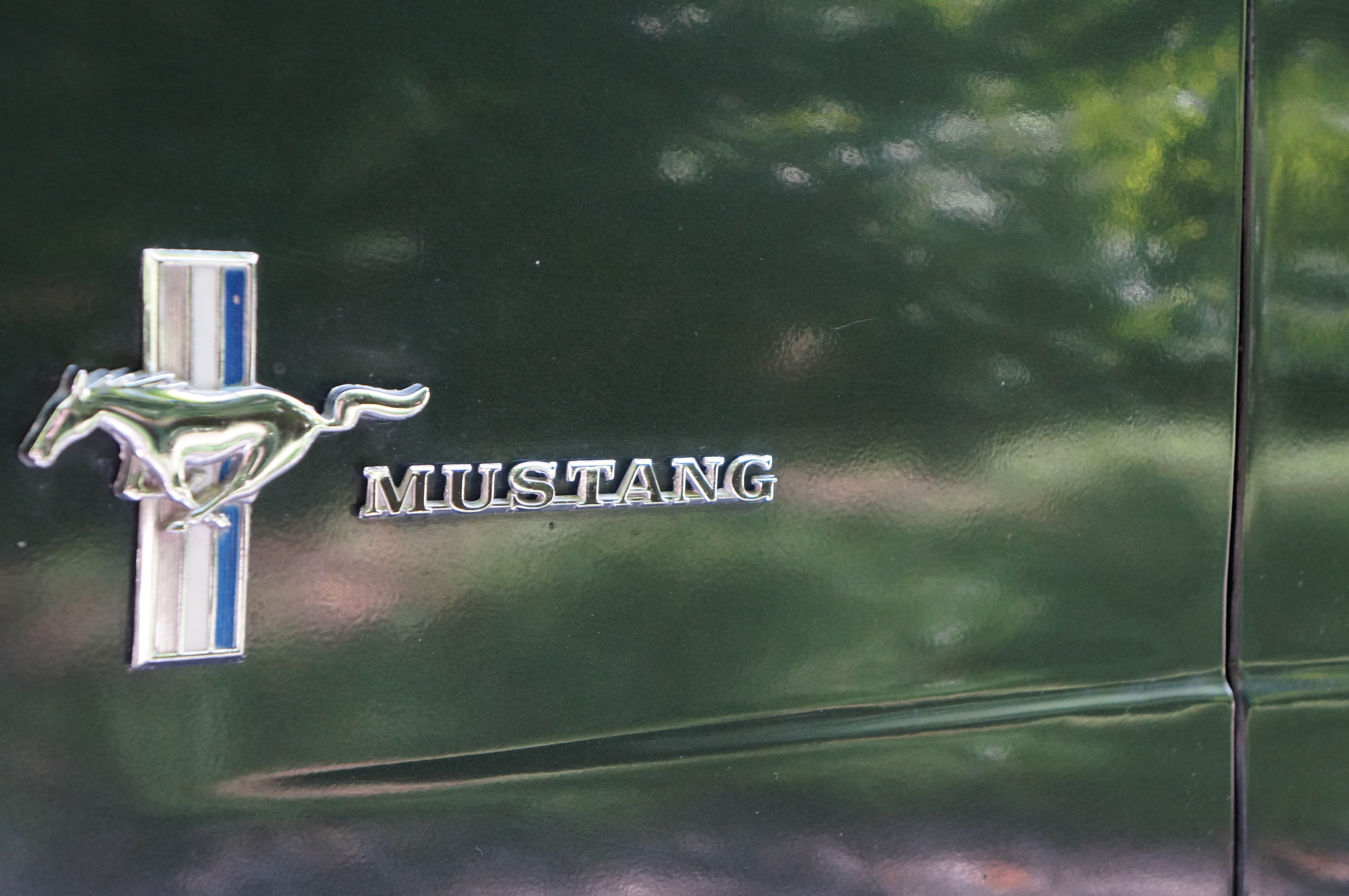
The Original Image
The First Pass at a Logo
Cropped and Straightened
Straightened Large Version

Sam, I like the idea of “MUSTANGSAM”, cropped and straightened. If you don’t mind me suggesting, try doing the photo without the background reflection, just a plain background, no foliage. Great idea tho. Rick
Sam, me again, Rick. After looking at the logo again, the red, white and blue stripes might need a repaint. Rick